Mobile Menu
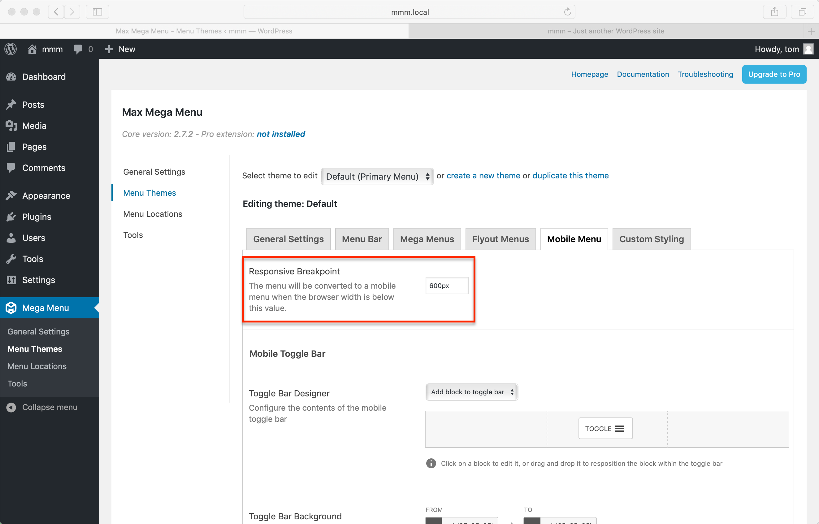
The Responsive Breakpoint
Your mega menu will automatically collapse down to a mobile style menu on smaller screens. To test the mobile menu simply reduce the width of your browser window. You can adjust the screen width at which the menu converts to a mobile style using the Responsive Breakpoint option in the Theme Editor.
It is a good idea to synchronise this option with your theme. For example, if your theme collapses to a mobile style layout at 768px wide, you might want to set the Responsive Breakpoint to 768px too.
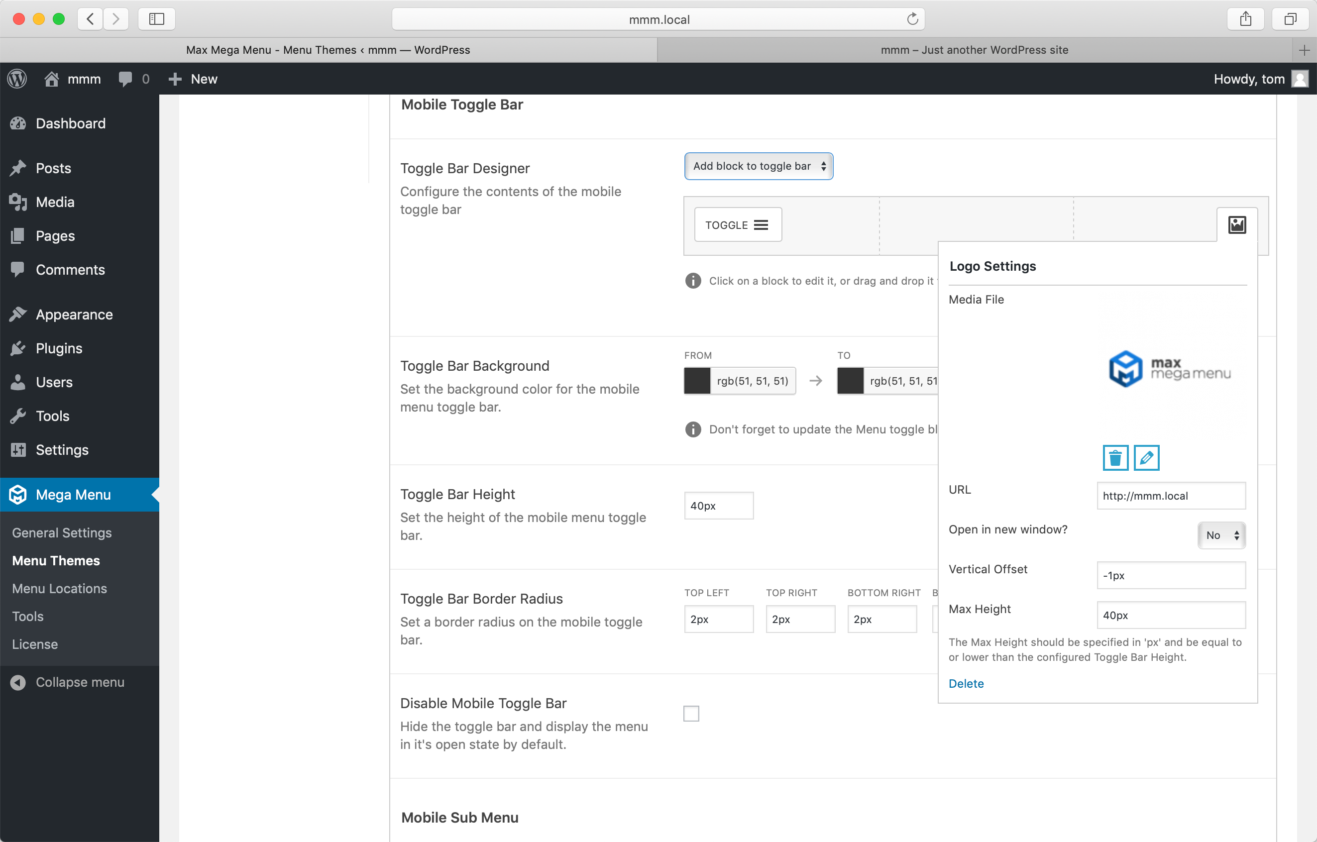
The Mobile Toggle Bar
We’ve built a drag and drop toggle bar designer into the theme editor. This allows you to control the elements within the toggle bar and their position. Pro users will be able to add advanced blocks to the toggle bar, including logos, search boxes, custom HTML and icons.
Styling the Mobile Menu
Use the options under Mega Menu > Menu Themes > Mobile Menu to adjust the style of your mobile menu. Note that the sub menu styling will be inherited from the desktop menu.
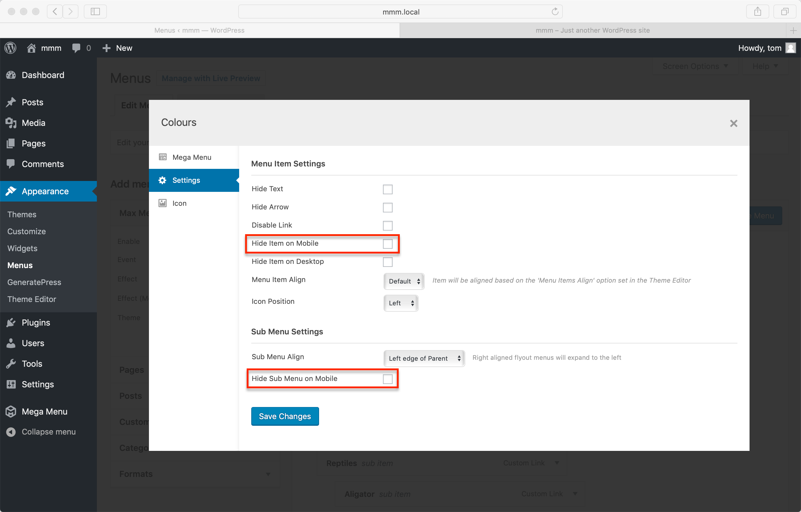
Controlling the visibility of items within the Mobile Menu
It is a good idea to keep your mobile menu as simple as possible. If you want to prevent a specific item or items from appearing in the mobile menu, head to the Appearance > Menus page, hover over the menu item in question and click the blue Mega Menu button to open the settings for that menu item. Enable the “Hide on mobile” option.
There is a “Hide Sub Menu on Mobile” option here too.
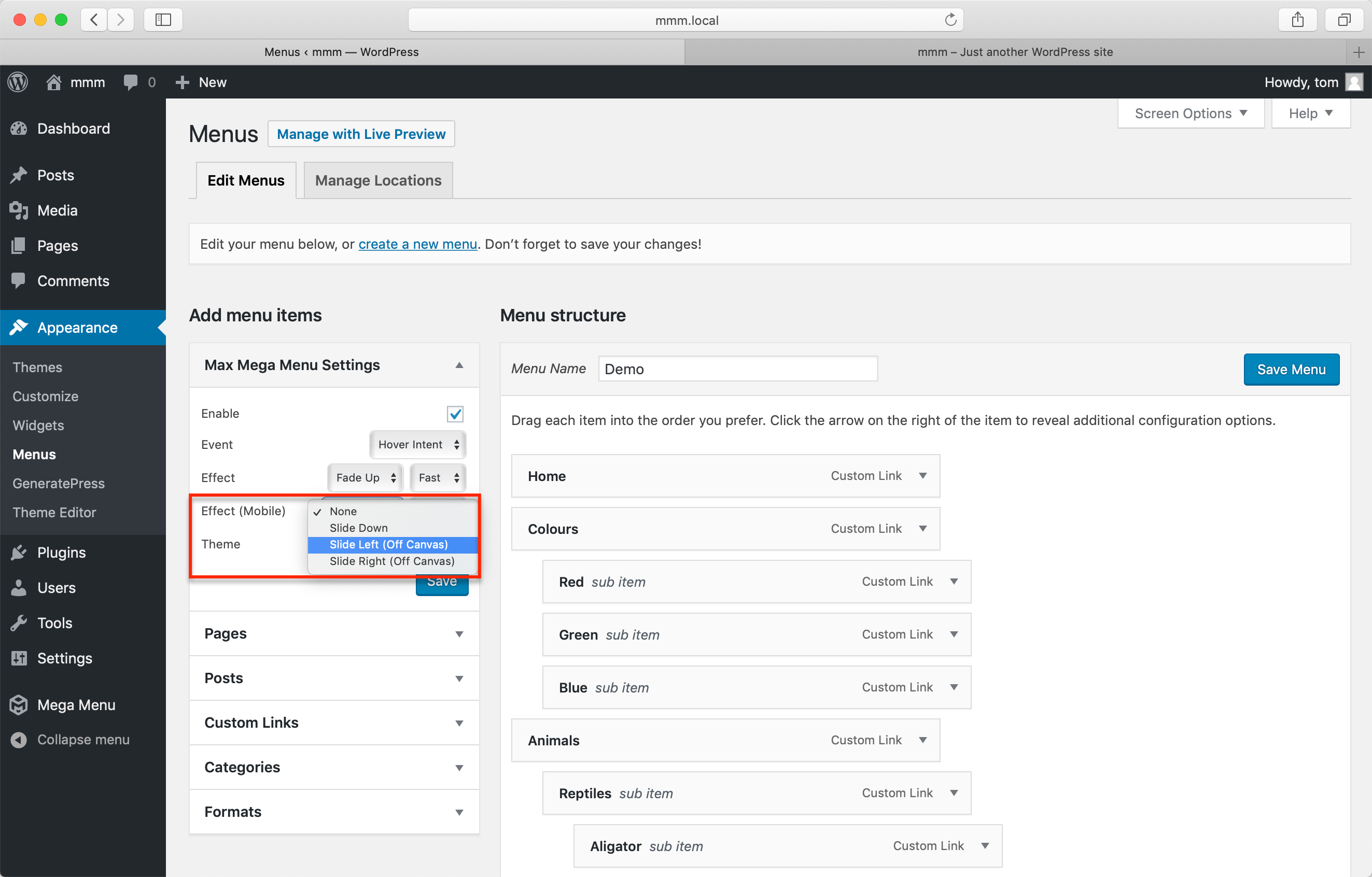
Mobile Menu Effect (Off Canvas or Standard)
With Max Mega Menu you can choose the type of mobile menu to use. By default the menu will drop down below the toggle bar when the toggle bar is clicked, but you can also choose an “off canvas” style where the mobile menu will slide in from the left or right hand side of the page.
To change the mobile menu style, go to Appearance > Menus and adjust the “Effect (Mobile)” option.
Click Event on Mobile
If you have set your desktop menu to show the sub menus on Hover, we will automatically switch the event to Click on mobiles/touch screen devices. This enables uses with touch screen devices to navigate the menu. For items which represent both a link to a page, but also toggle the visibility of their sub menu, there is an option under Mega Menu > Menu Locations > Click Event Behaviour. This will let you select between:
- First click opens sub menu, second click follows link (default)
- First click opens sub menu, second click closes sub menu