Astra
Fixing the mobile menu when using the Header Builder
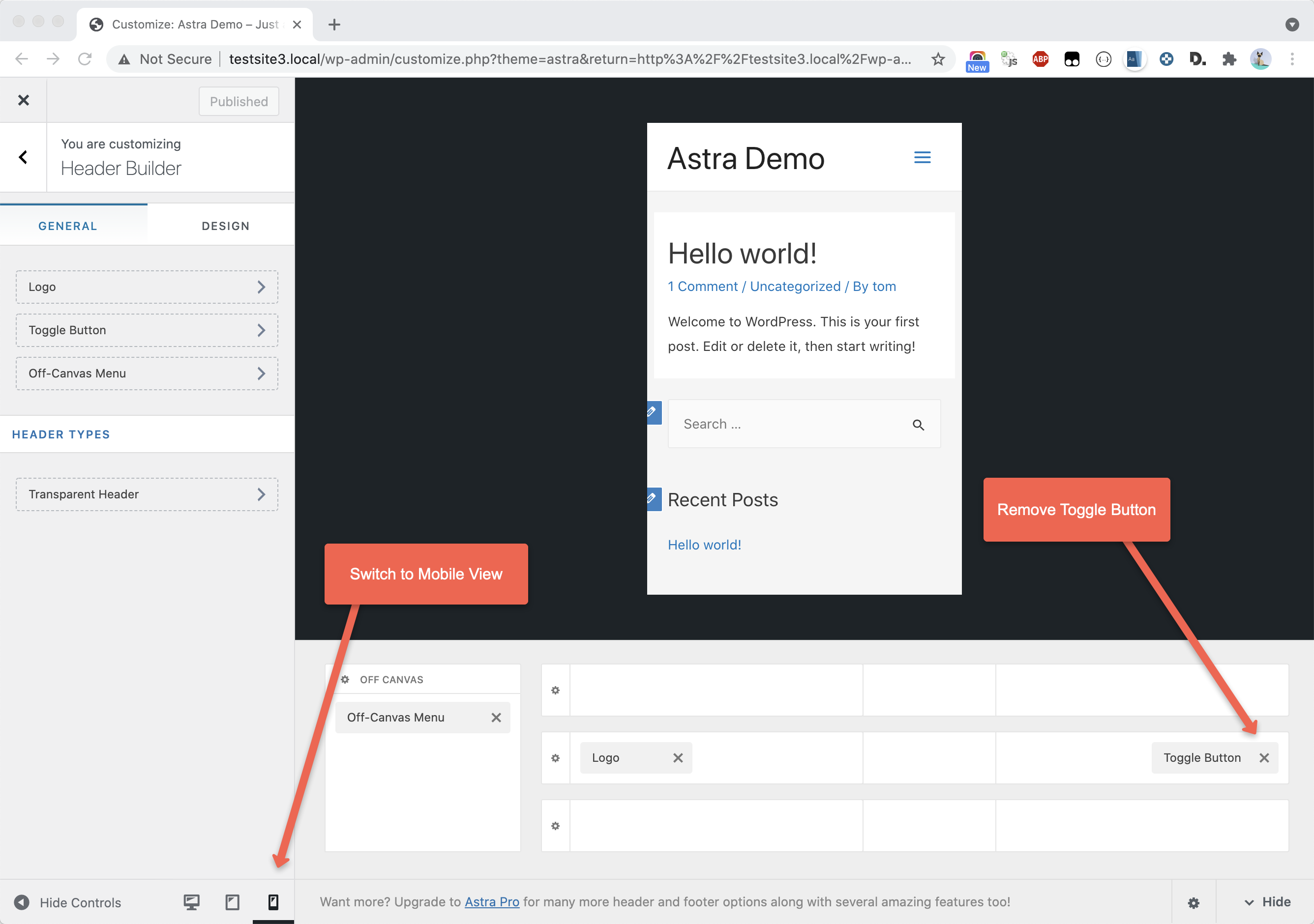
First, open the Customiser and navigate to the Header Builder. Switch to the mobile view and remove the Toggle Button block:
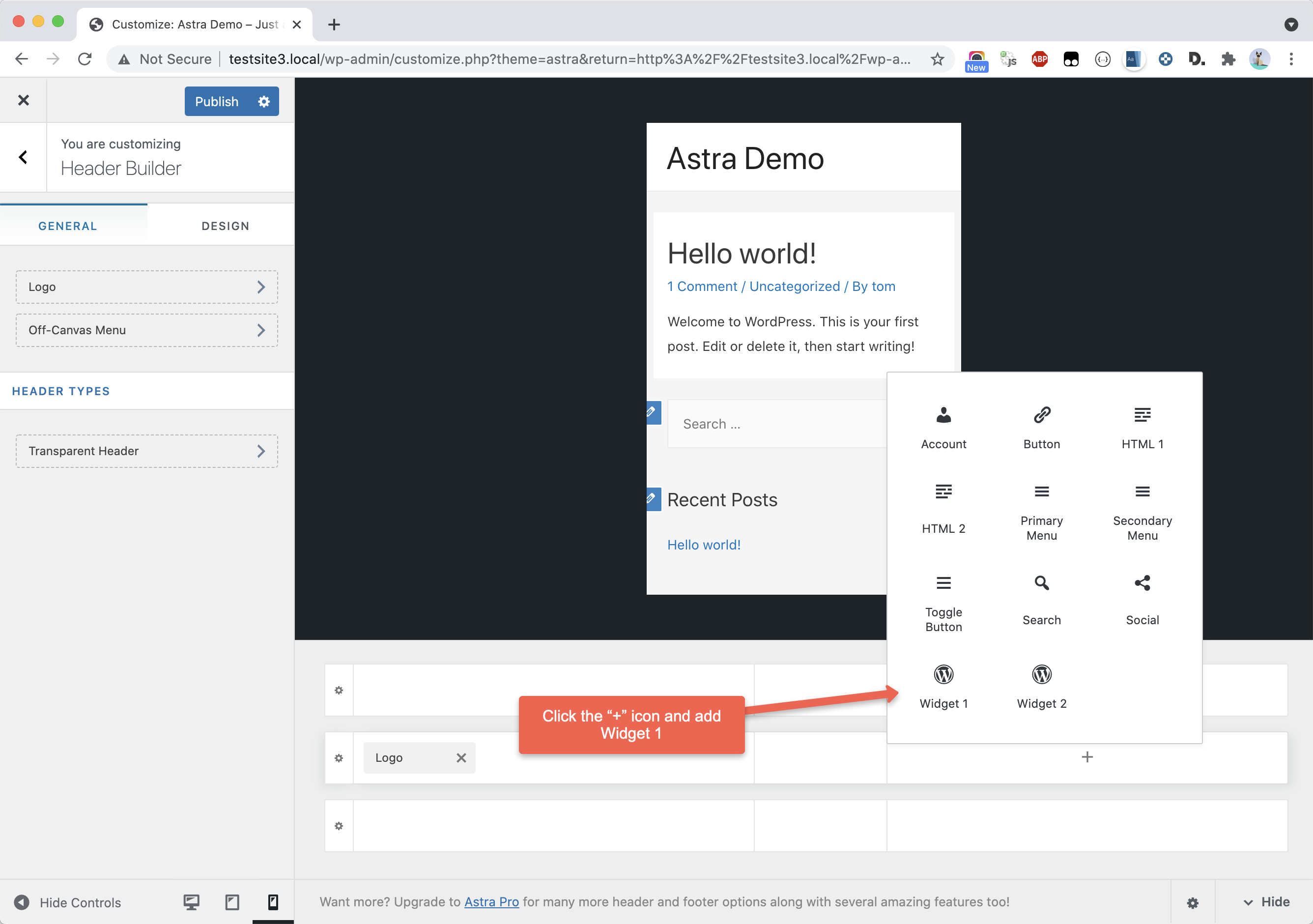
Next, add the “Widget 1” block to the layout:
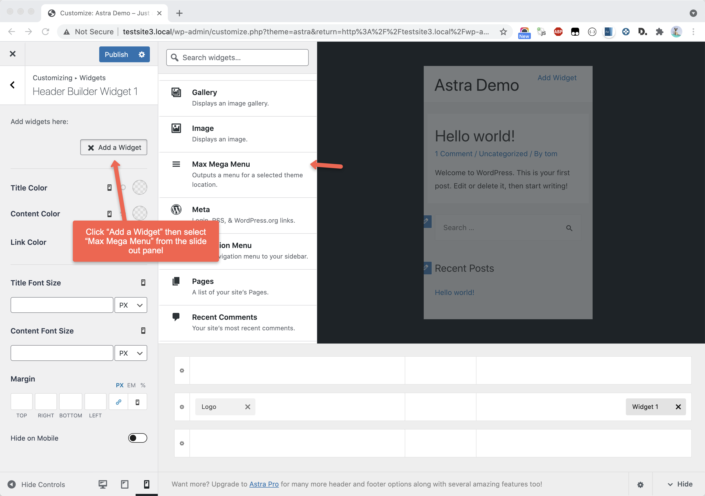
Add the “Max Mega Menu” widget to the widget area:
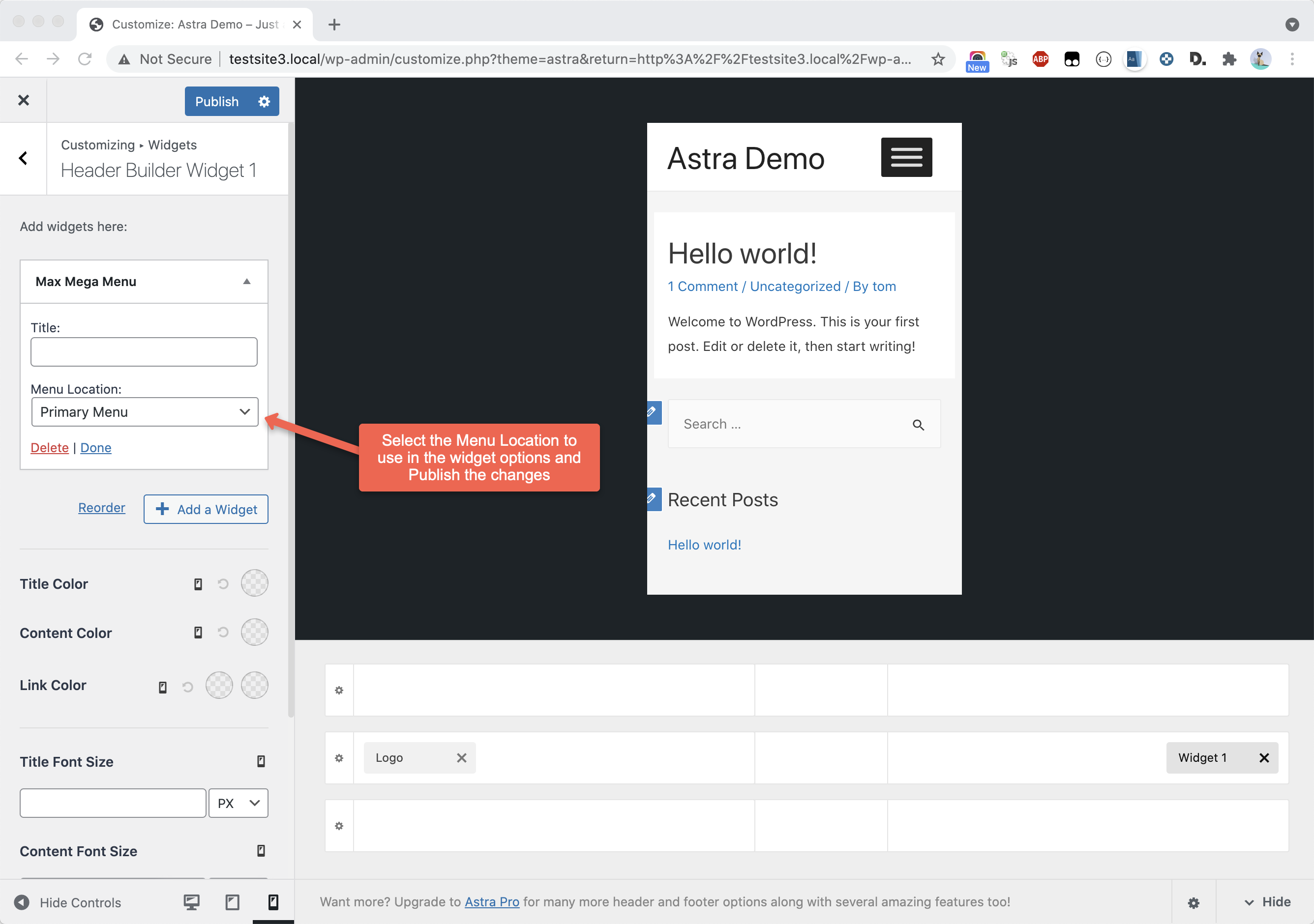
Choose the menu location to display for your mobile menu in the widget settings:
Restore Menu Alignment
By default the Astra menu is positioned to the right hand side of the page, and the menu item links are aligned to the right also.
When Max Mega Menu is enabled the menu will be positioned next to the logo. To make the menu fill the header area, go to Appearance > Customize > Additional CSS and add the following:
|
1 2 3 |
body.mega-menu-primary .header-main-layout-1 .ast-main-header-bar-alignment { flex-grow: 1; } |
If you want the menu item links to be aligned to the right hand side of the menu bar, go to Mega Menu > Menu Themes > Menu Bar and set Menu Items Align to “Right”.
Hide Duplicate Mobile Menu button
When Max Mega Menu is enabled for the Primary Menu location you will see 2 mobile toggle buttons.
To remove the theme mobile toggle button, leaving you with just the Max Mega Menu toggle bar, go to Appearance > Customize > Additional CSS and enter the following:
|
1 2 3 4 5 6 7 |
.mega-menu-primary .main-header-bar-navigation { display: block !important; } .mega-menu-primary .ast-mobile-menu-buttons { display: none !important; } |
Full Width Mega Sub Menus
To make the mega sub menus span the entire width of the page (rather than just the width of the menu bar), go to Mega Menu > Menu Themes and select your active menu theme. Within the Mega Menus tab, set:
Panel Width (Outer): body
Panel Width (Inner): .ast-container
“Ghost” Menu
If you are seeing a “ghost”/duplicated menu in the header, go to Mega Menu > Menu Themes > Custom Styling and add the following:
|
1 2 3 |
#{$wrap} #{$menu} { visibility: inherit; } |