Divi 5
With the release of Divi 5, we have included a new native Max Mega Menu module to display your mega menu within the Divi Theme Builder.
Step 1 – Create the menu
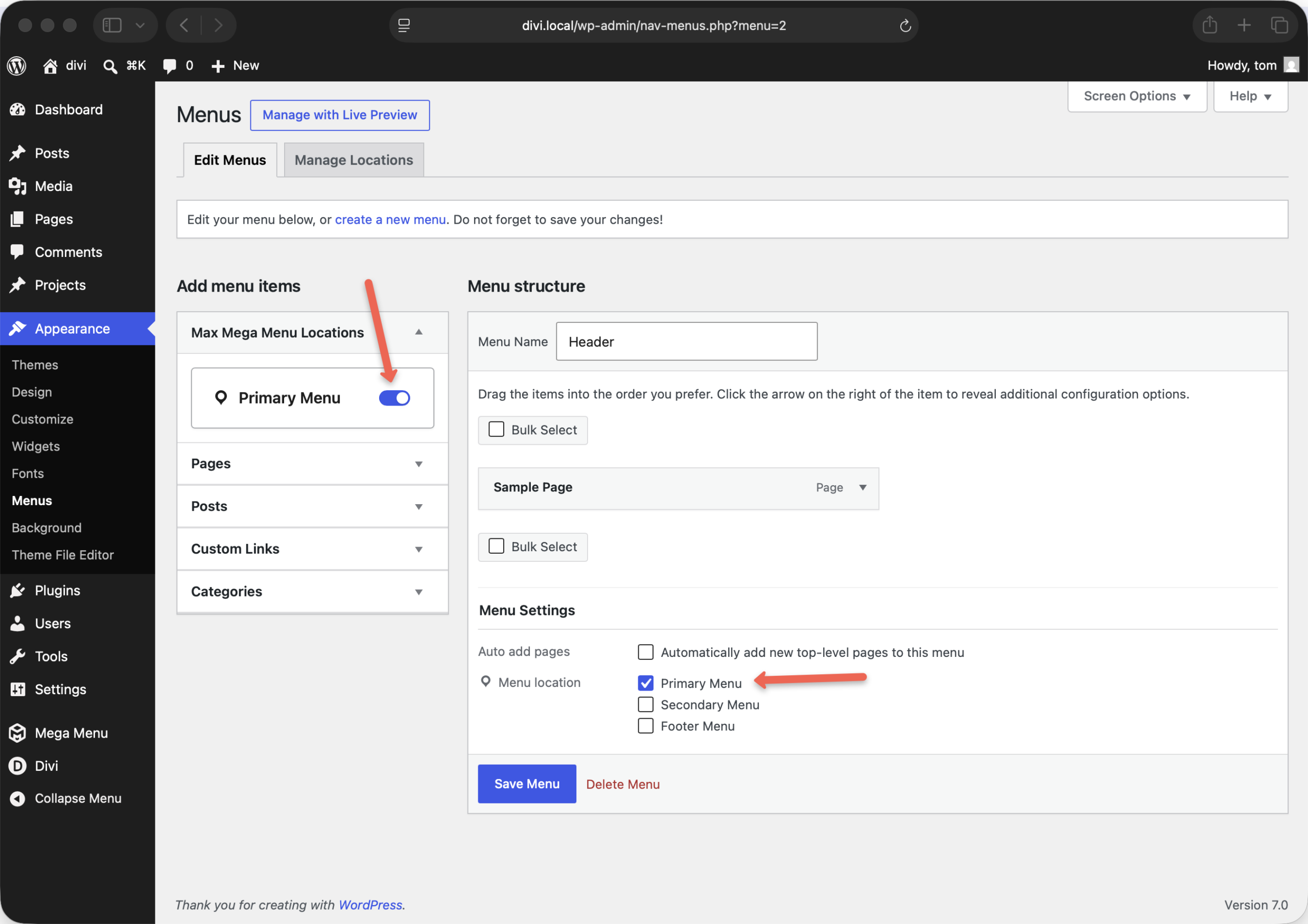
This step is the same for all themes. First we need to create a new menu, tag it the Primary Menu location and enable Max Mega Menu.
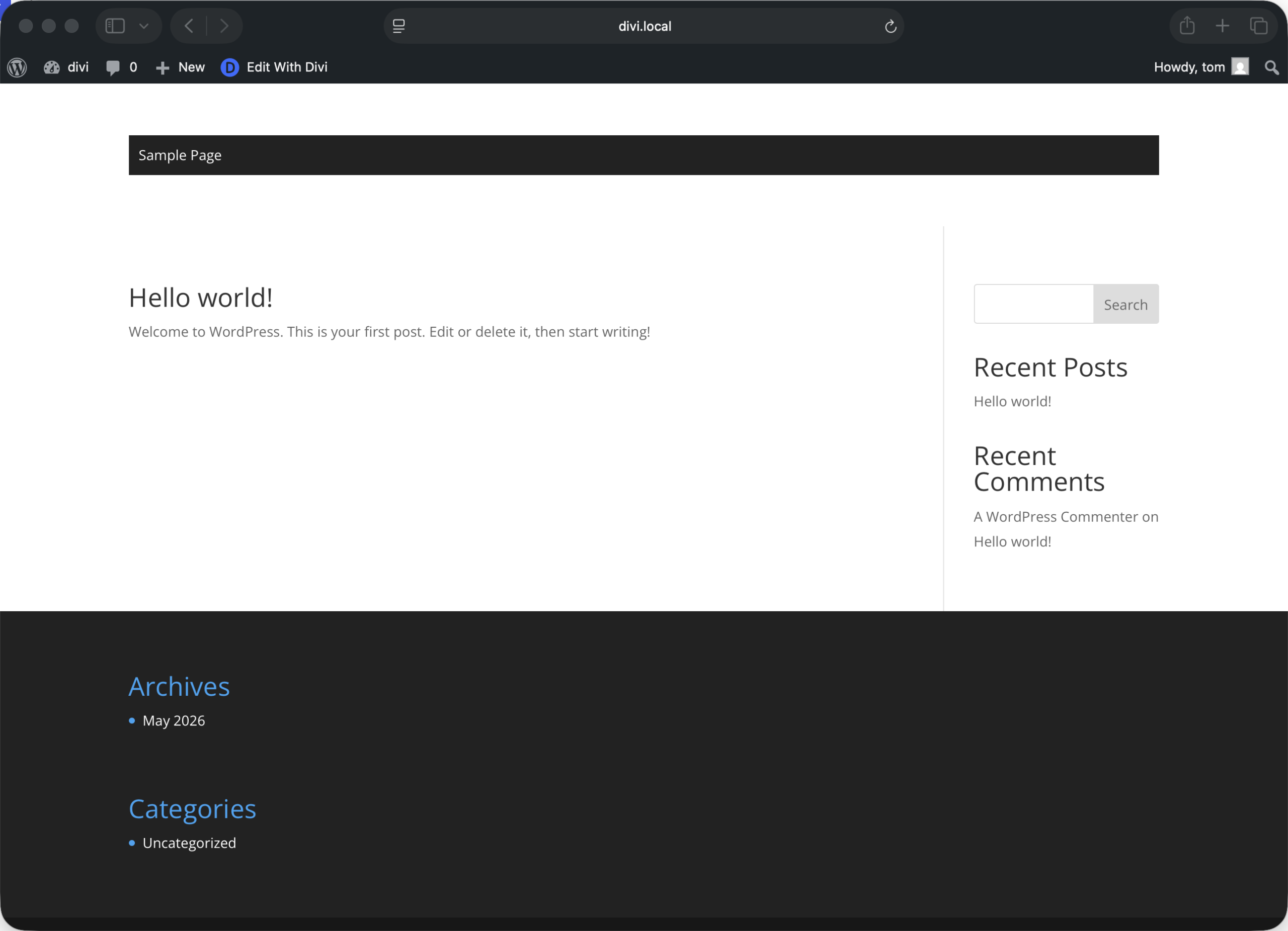
Step 2: Output the menu using the Divi Theme Builder
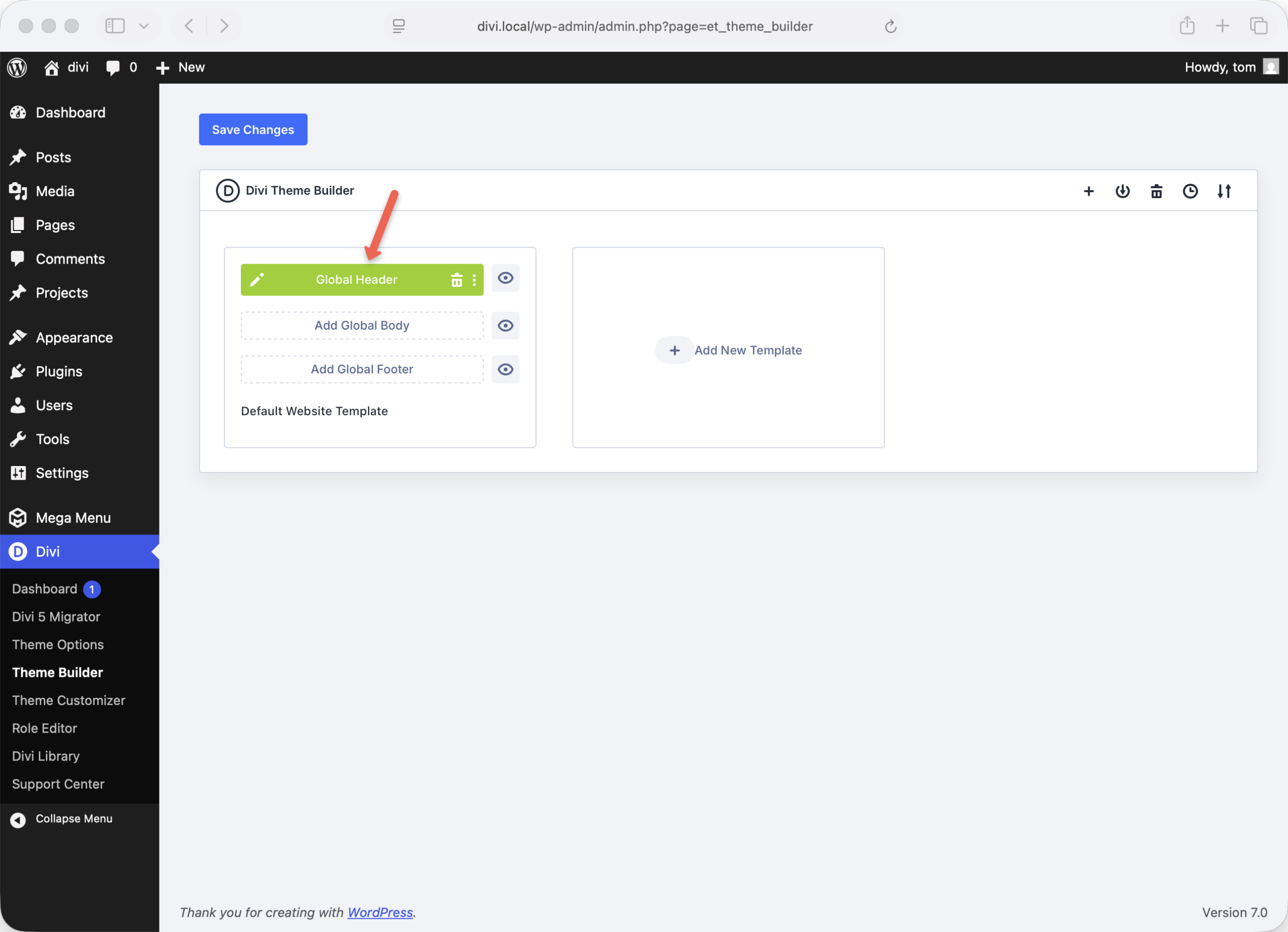
Go to Divi > Theme Builder and click “Add Global Header”. In the small popup that appears, click “Build Global Header”. On the next screen, click “Build From Scratch”.
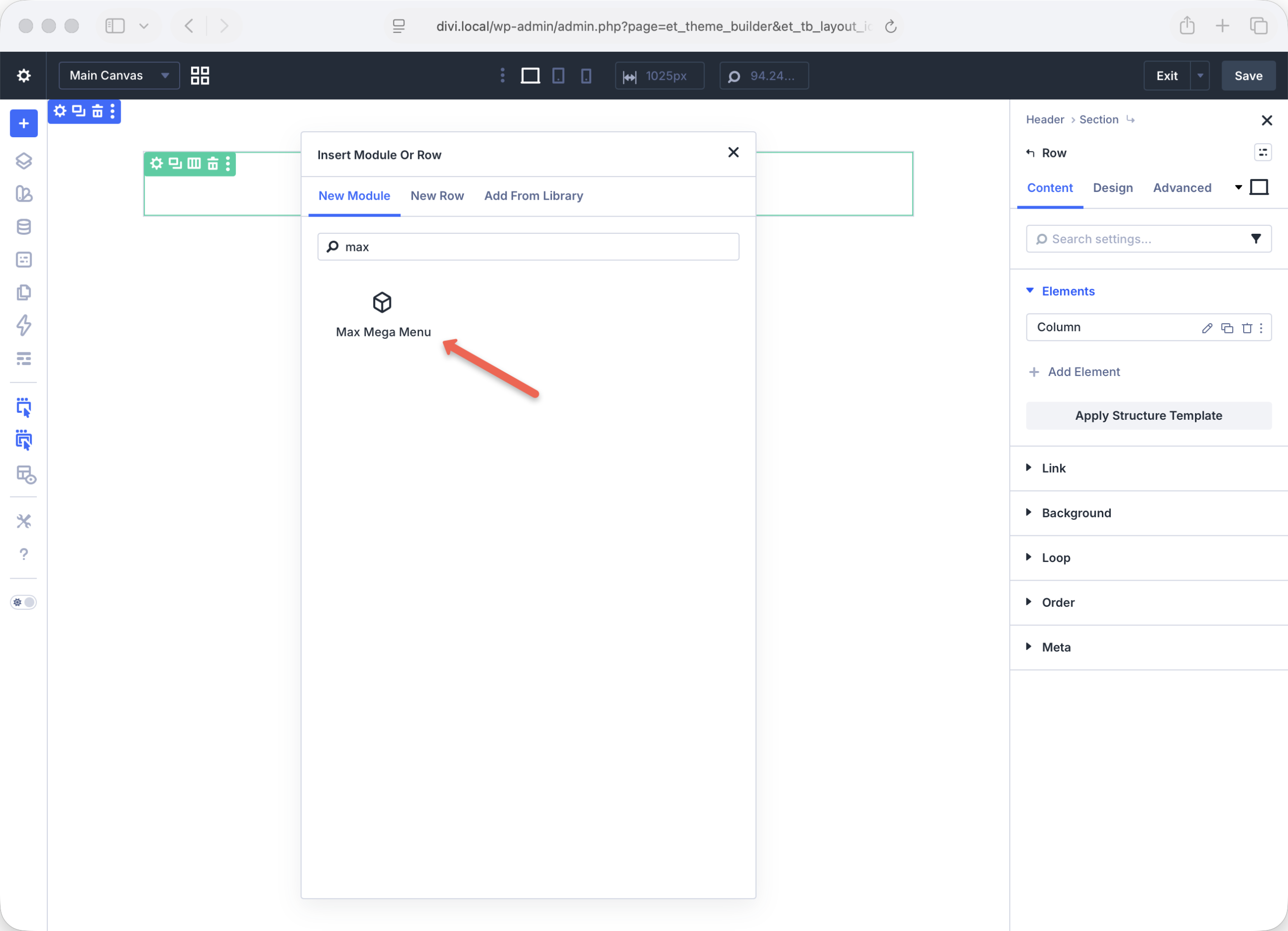
Create a new full width row and insert the Max Mega Menu module:
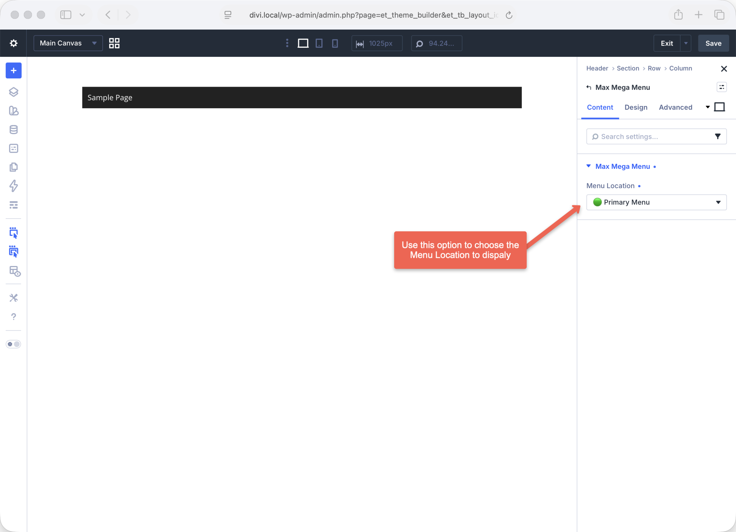
The Primary Menu location will now be added to the header.
With Max Mega Menu, you can create multiple menu locations, each with their own menu structure and configuration.
Fix z-index
If your menu is appearing behind other page elements, go to Appearance > Customize > Additional CSS and add the following:
header {
    position: relative;
    z-index: 9999999;
}
End Result
We now have a “stock” version of Max Mega Menu output on the site.
From here we can build the menu out, including changing the styling, adding a logo, search box, custom icons etc.