Flatsome
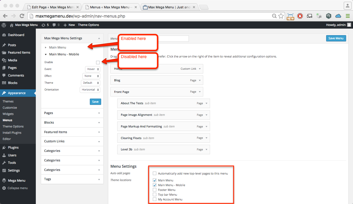
Under Appearance > Menus, tag your main menu to both the ‘Main Menu’ and ‘Main Menu – Mobile’ Location.
Enable Max Mega Menu for the Main Menu location (but not the ‘Main Menu – Mobile’ Location – we will let the theme manage the mobile menu).
Under Mega Menu > Menu Themes, apply the following settings (these are the important settings, others can be adjusted to your own requirements).
- Menu Bar > Menu Background: Transparent
- Menu Bar > Top Level Menu Items > Font: Black
- Menu Bar > Menu Height: 50px
- Mega Menu > Panel Width (outer): try .header-inner OR .row*
- Mobile Menu > Responsive Breakpoint: 48em
For full width mega sub menus, apply the following:
- Mega Menu > Panel Width (outer): body
- Mega Menu > Panel Width (outer): try .header-inner OR .row*
* This setting will depend on your theme setup, try each one and decide which you prefer
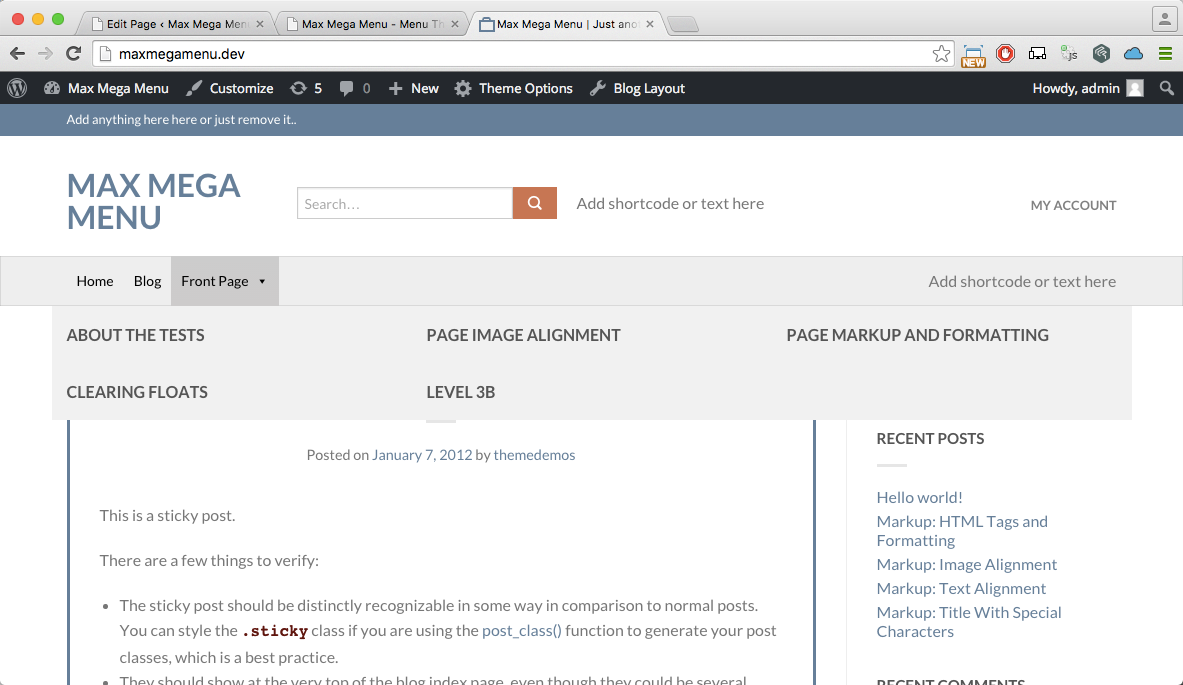
After updating the theme settings, your menu should look something like this on desktop:
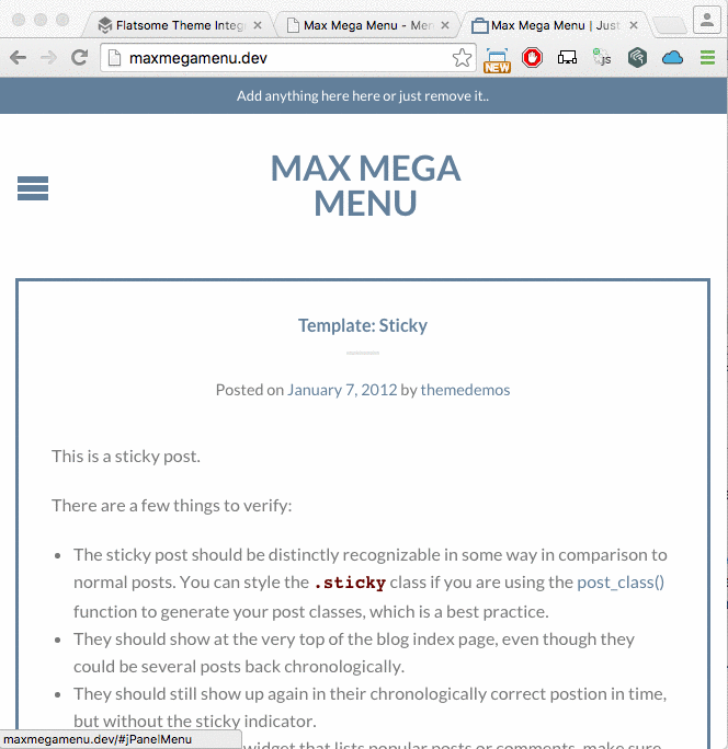
… and something like this on mobile (the default theme mobile menu):
Using the Max Mega Menu mobile menu
If you would prefer to use the Max Mega Menu mobile menu, use the Flatsome Header Designer.
Switch to the Mobile/Tablet view and remove the default ‘Nav Icon’ block from the mobile header. Replace this with a 100% wide HTML block (on a new row below the logo, not on the same row as the logo) that contains the menu shortcode:
|
1 |
[maxmegamenu location=primary] |
You may wish to go to Appearance > Menus > Max Mega Menu Settings and switch the “Effect – Mobile” to one of the Off Canvas options.