The mobile menu is completely hidden
By default, the Mobile Menu should appear on screen widths below 600px. You can adjust this value in the Theme Editor (see the Responsive Breakpoint setting).
- The menu will not switch to a mobile style menu if you have set the Responsive Breakpoint to 0px.
- The menu will not switch to a mobile style menu until your screen width is below the Responsive Breakpoint value.
If you can’t see the mobile menu at all then it will be due to residual styling. Your theme will be hiding one of the elements that contains the menu. Please check to see if we already have an integration guide for your theme before using the following option.
Here is a fairly typical example of a theme hiding the menu on mobiles/smaller screens:
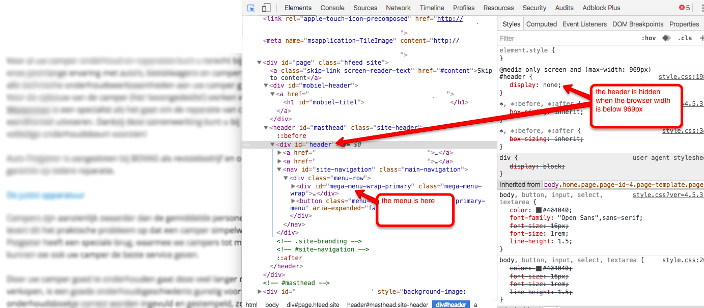
In the example above the following Custom CSS will make the mobile menu visible again:
|
1 2 3 |
header { display: block !important; } |
The CSS fix will depend on your theme HTML and CSS. You will need to inspect the page using Browser Tools to identify the element which needs to be un-hidden.