Twenty Twenty
Full Width Sub Menus
By default the sub menus will only be as wide as the menu itself. To make the Mega Sub Menus span the full width of the page, go to Mega Menu > Menu Themes > Mega Menus and set:
Panel Width (Outer): .header-inner
Panel Width (Inner): 100%
Mobile Menu
Option 1: Keep the default theme mobile menu
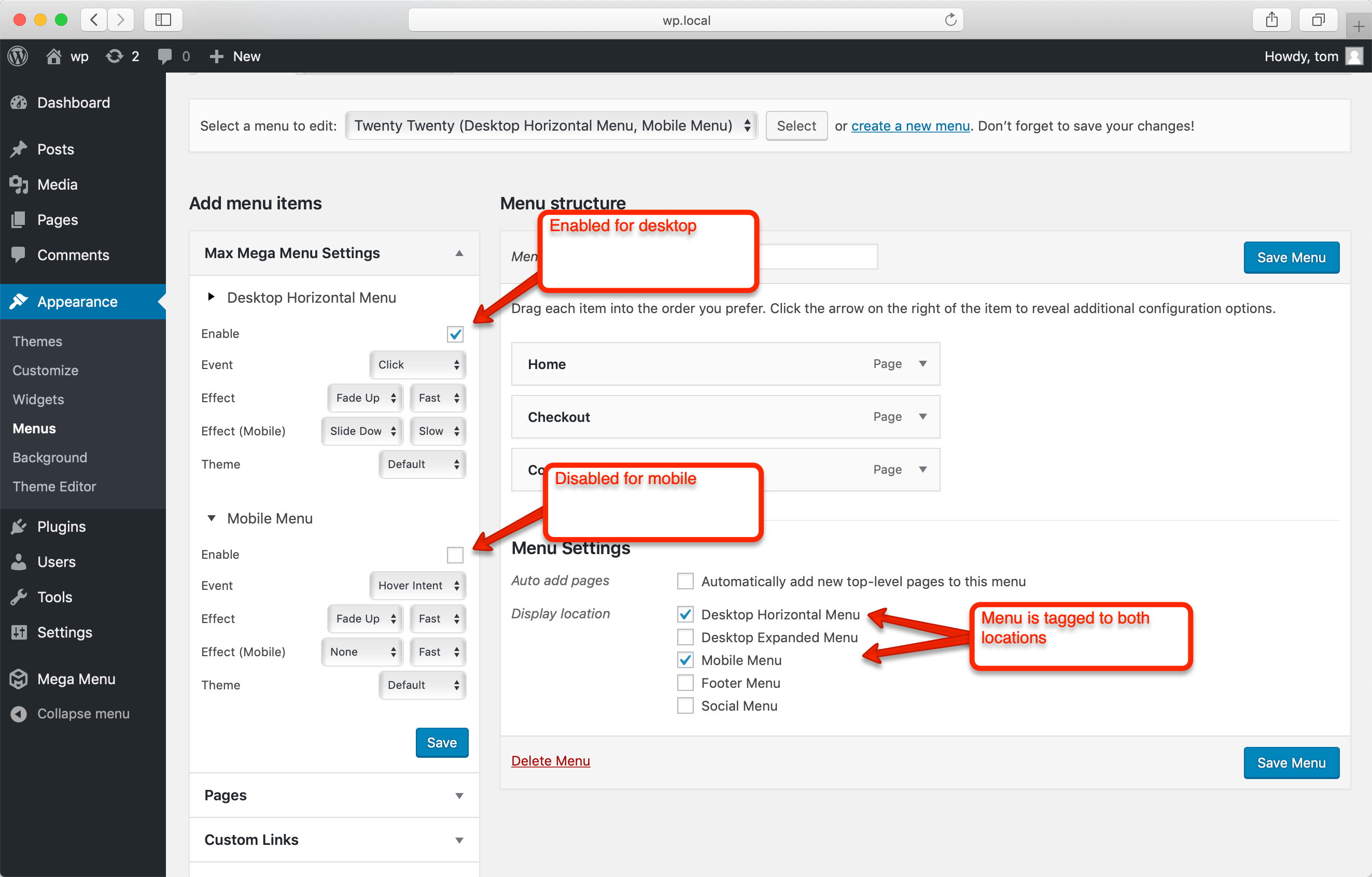
To keep the default theme mobile menu, tag your menu to the Desktop Horizontal Menu and Mobile Menu locations, but only enable Max Mega Menu for the Desktop Horizontal Menu location.

Option 2: Replace the mobile header with Max Mega Menu
Go to Appearance > Customize > Additional CSS and add the following:
@media (max-width: 1000px) {
     body.mega-menu-primary .header-titles-wrapper {
         display: none;
     }
     body.mega-menu-primary .primary-menu-wrapper,
     body.mega-menu-primary .header-navigation-wrapper,
     body.mega-menu-primary ul.primary-menu {
         display: block;
         margin: 0;
     }
 }
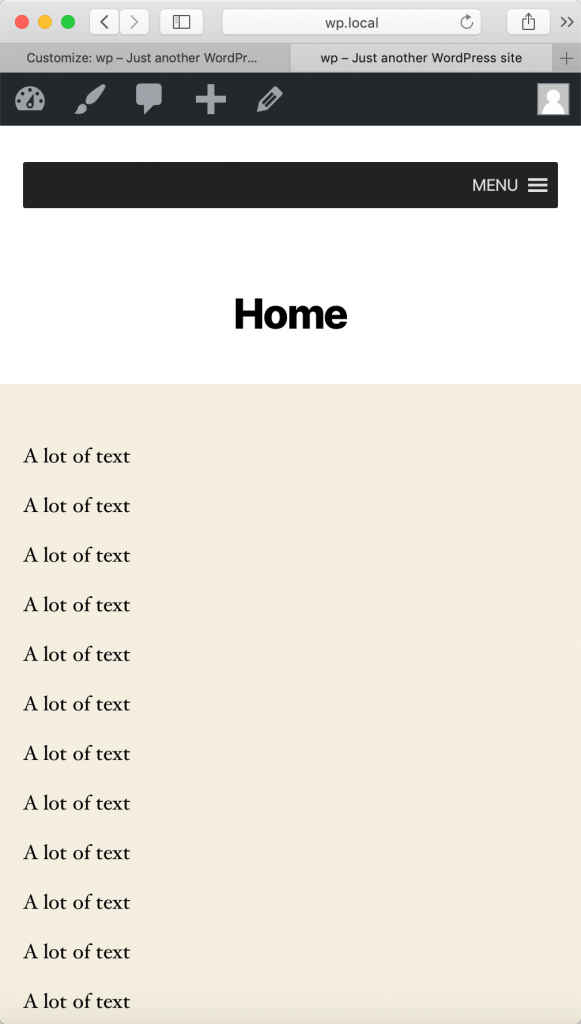
The “Desktop Horizontal Menu” will now be displayed for both desktop and mobile.
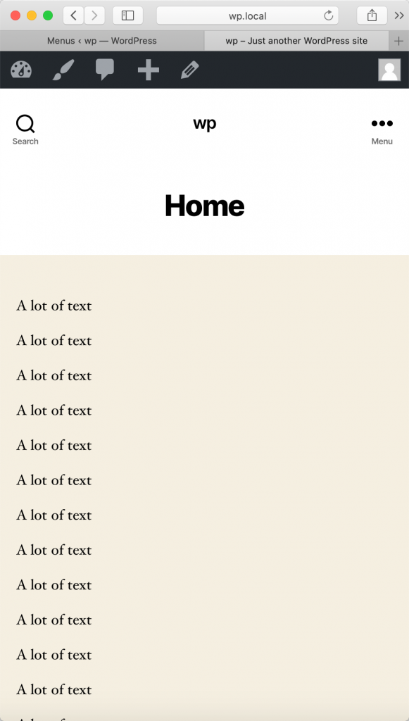
Before

After
