Configuring mobile menu plugins to work with Max Mega Menu
There are many plugins available which will add a dedicated mobile menu to your website. If you prefer to use one of these instead of the default Max Mega Menu mobile menu, these instructions will help you configure your dedicated mobile menu plugin.
There are many dedicated mobile menu plugins available, including Responsive Menu and ShiftNav.
These plugins are configured in much the same way (requiring the CSS selector of the menu to hide), in this example we will use Responsive Menu.
The Responsive Menu main settings
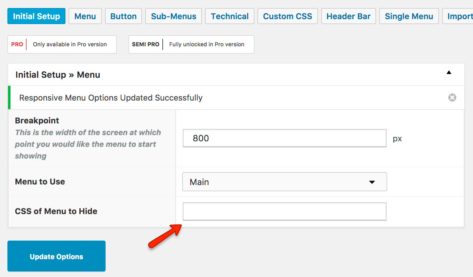
How to find the “CSS of Menu to Hide”
Right click on your webpage and go to “View Source”.
Search for “mega-menu-wrap”:
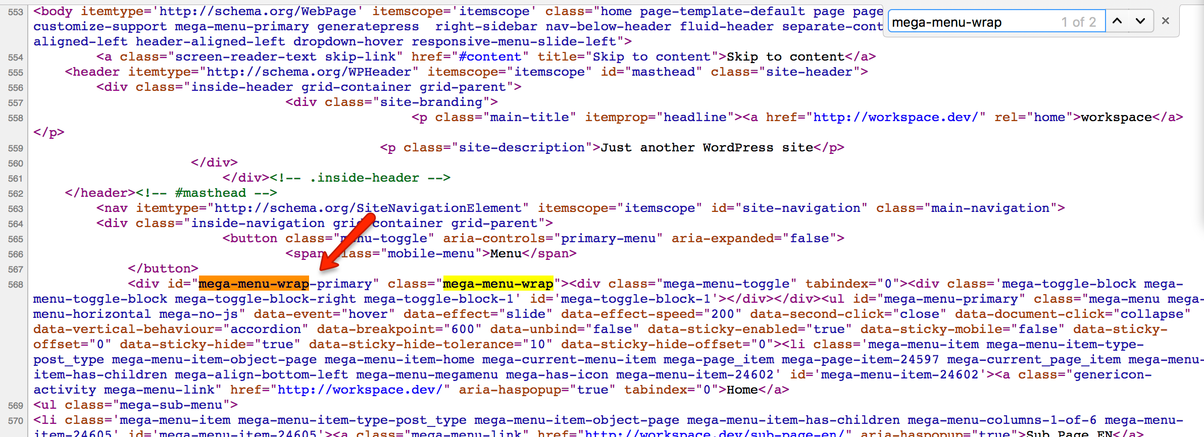
You should find an ID which looks similar to the above (mega-menu-wrap-primary) – the last word (primary) may be different depending on your theme setup.
Copy this ID, and prefix it with “#”. You should end up with something like:
|
1 |
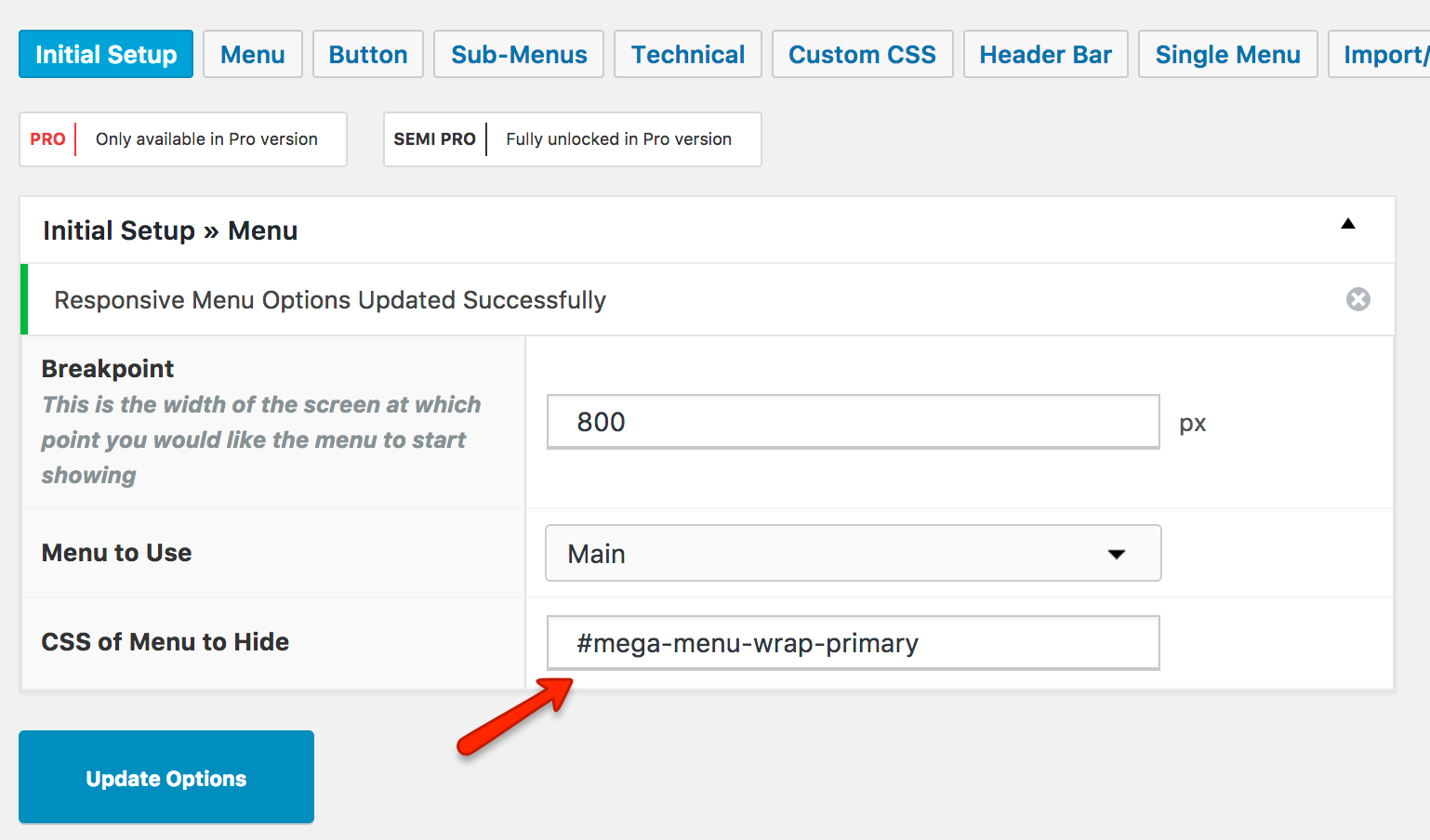
#mega-menu-wrap-primary |
This is the selector to paste into the “CSS of Menu to Hide” field.
Plugin Support
Please note, although we have documented how to configure these plugins with Max Mega Menu, as we are not the authors we do not support them ourselves. Any support issues related to these plugins should be directed to the plugin authors.