Menu Setup
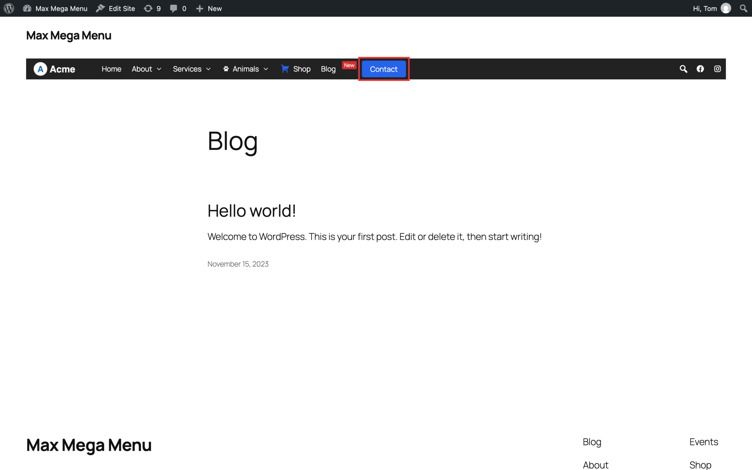
In this example we will change the “Contact” menu item so that it is styled independently of the rest of the menu items, giving it a “button” appearance.
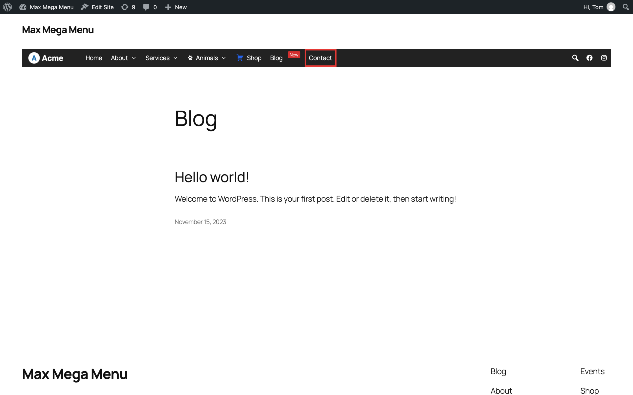
The “Contact” menu item is a standard menu item added to the menu in the usual way. You can use any existing menu item, or add a new Page or Custom Link item.
Applying the “Button” Styling
Go to Appearance > Menus, hover over the “Contact” menu item and click the blue “Mega Menu” button. This will open up the mega menu settings for the menu item. Go to the “Styling” tab (see Custom Item Styling for more information).
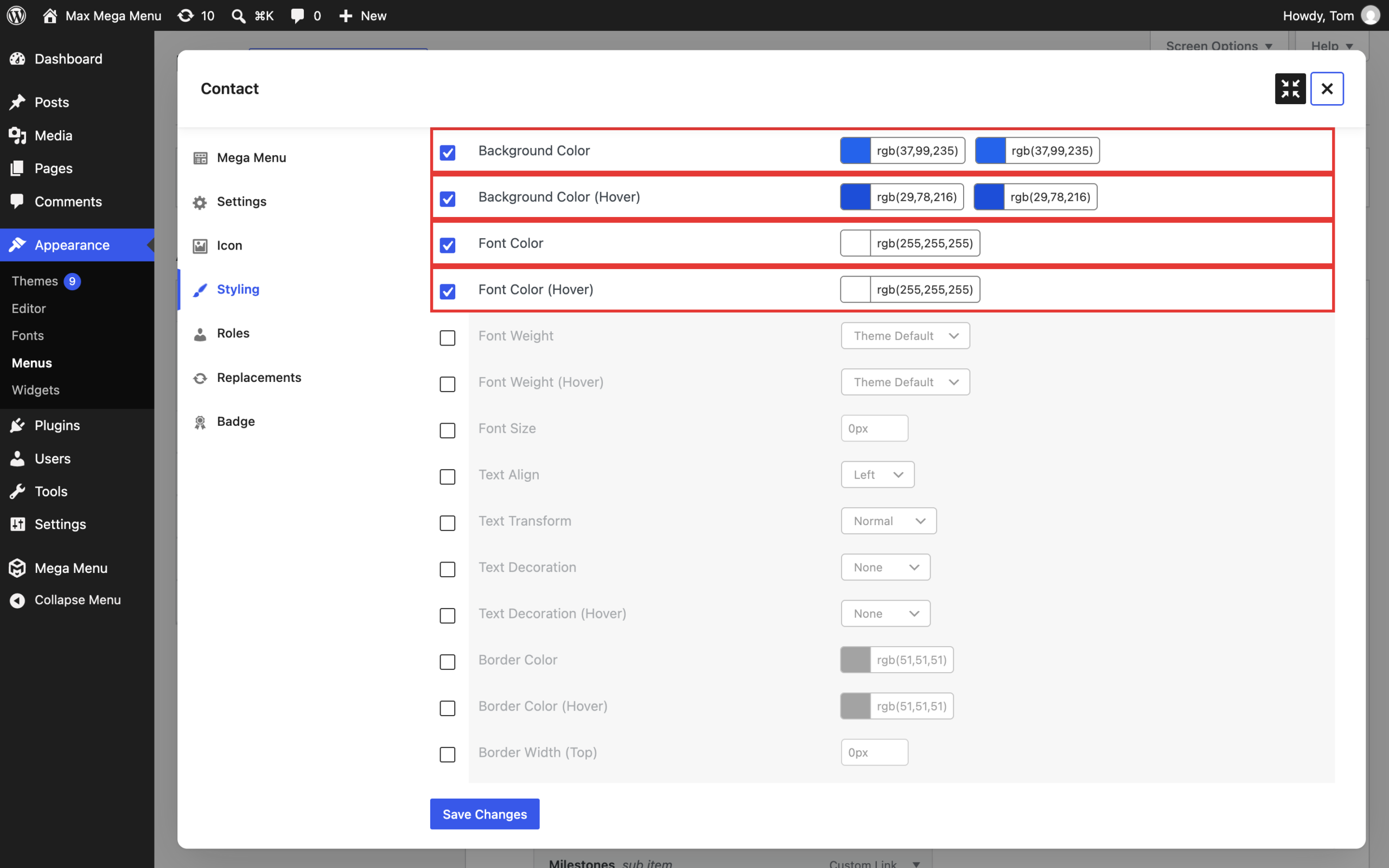
Enable (check) each option you want to override. In our example, we’ll apply the following styling to the Contact menu item:
- Background Color: Blue (and a slightly darker blue for Background Color (Hover))
- Font Color and Font Color (Hover): White
- Border Radius (Top Left, Top Right, Bottom Right, Bottom Left): 4px
- Menu Item Padding (Left and Right): 16px
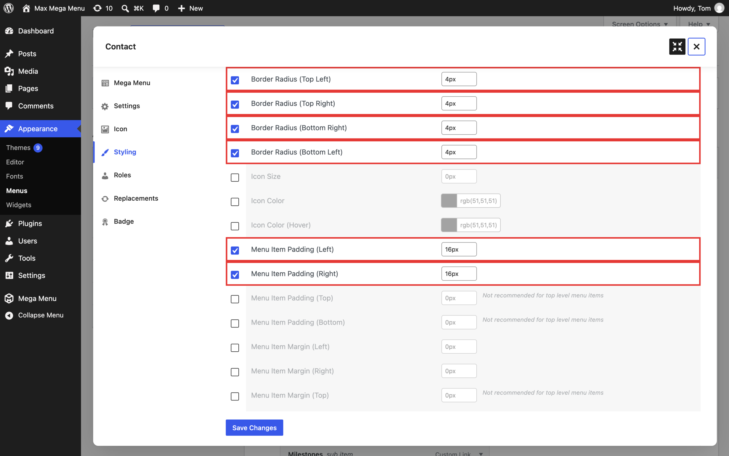
- Menu Item Height: 32px (this should be less than the height of your menu bar)
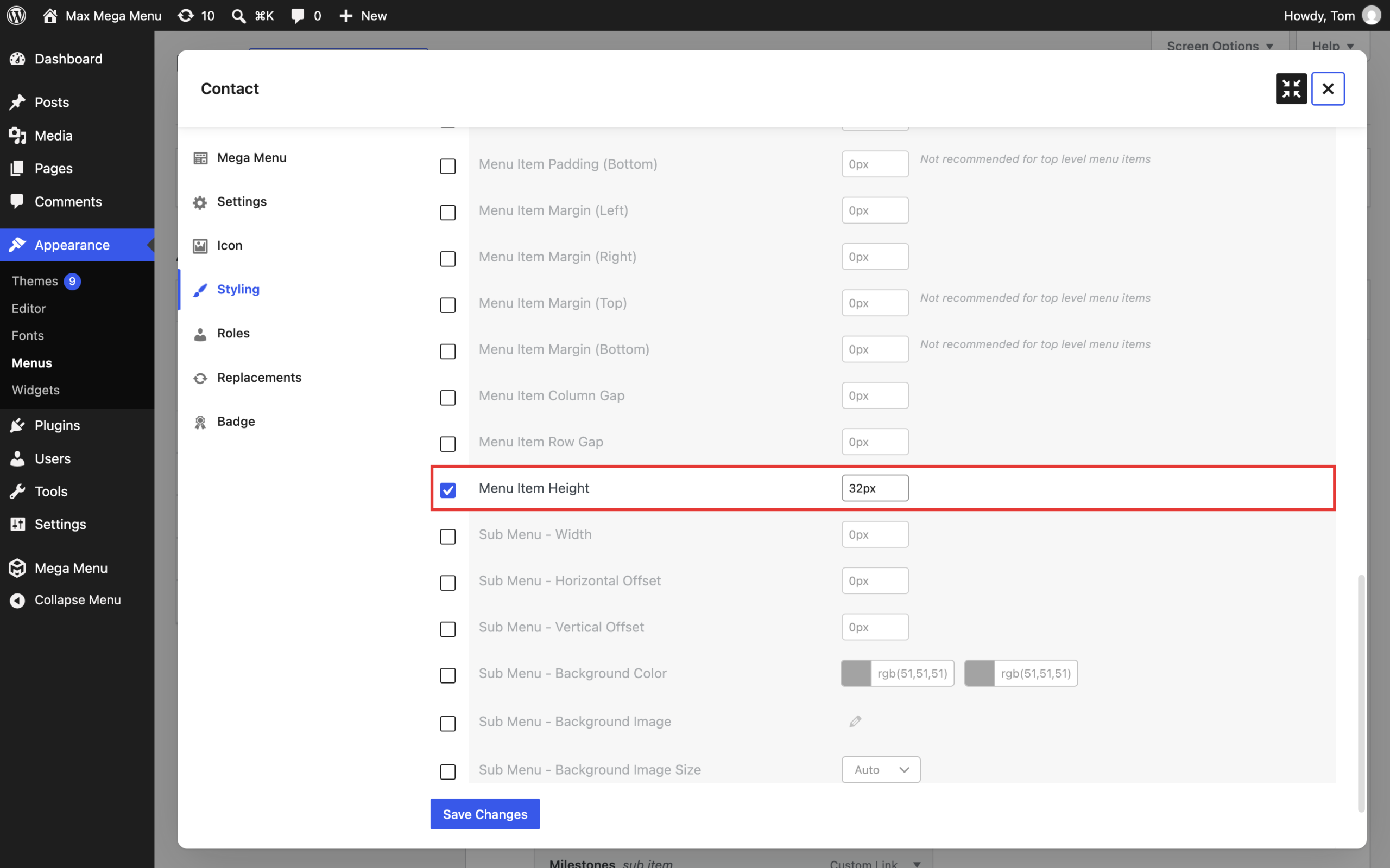
Click “Save Changes”.
Note: If you are using the “Use Flex CSS” option (Mega Menu > Menu Themes > General Settings), the button will automatically be vertically centered within the menu bar. If not, you may need to apply a value to the “Menu Item Margin (Top)” option to push the menu item down.
End Result
After applying the custom styling, the “Contact” menu item has a button like appearance: