Step 1: Enable Flex CSS
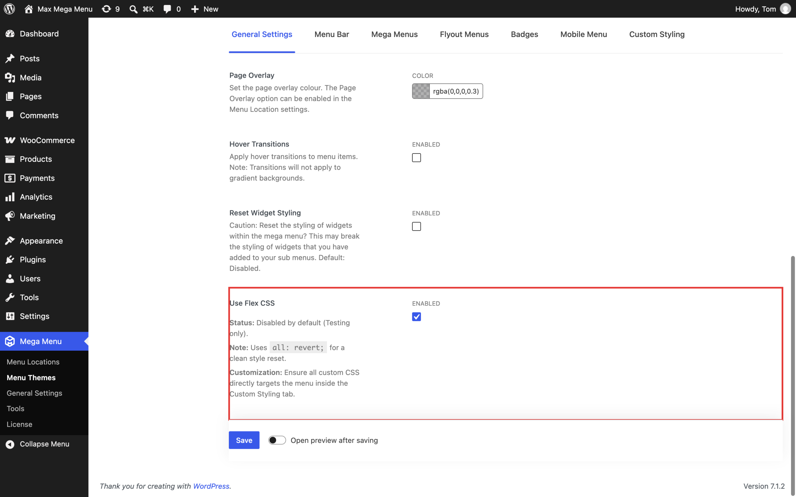
Go to Mega Menu > Menu Themes > General Settings and enable the “Use Flex CSS” option, then save the theme. With Flex CSS enabled, multi-line menu items are automatically vertically centered within the menu bar, so no custom CSS or custom classes are required.
Step 2: Add a line break to the menu item title
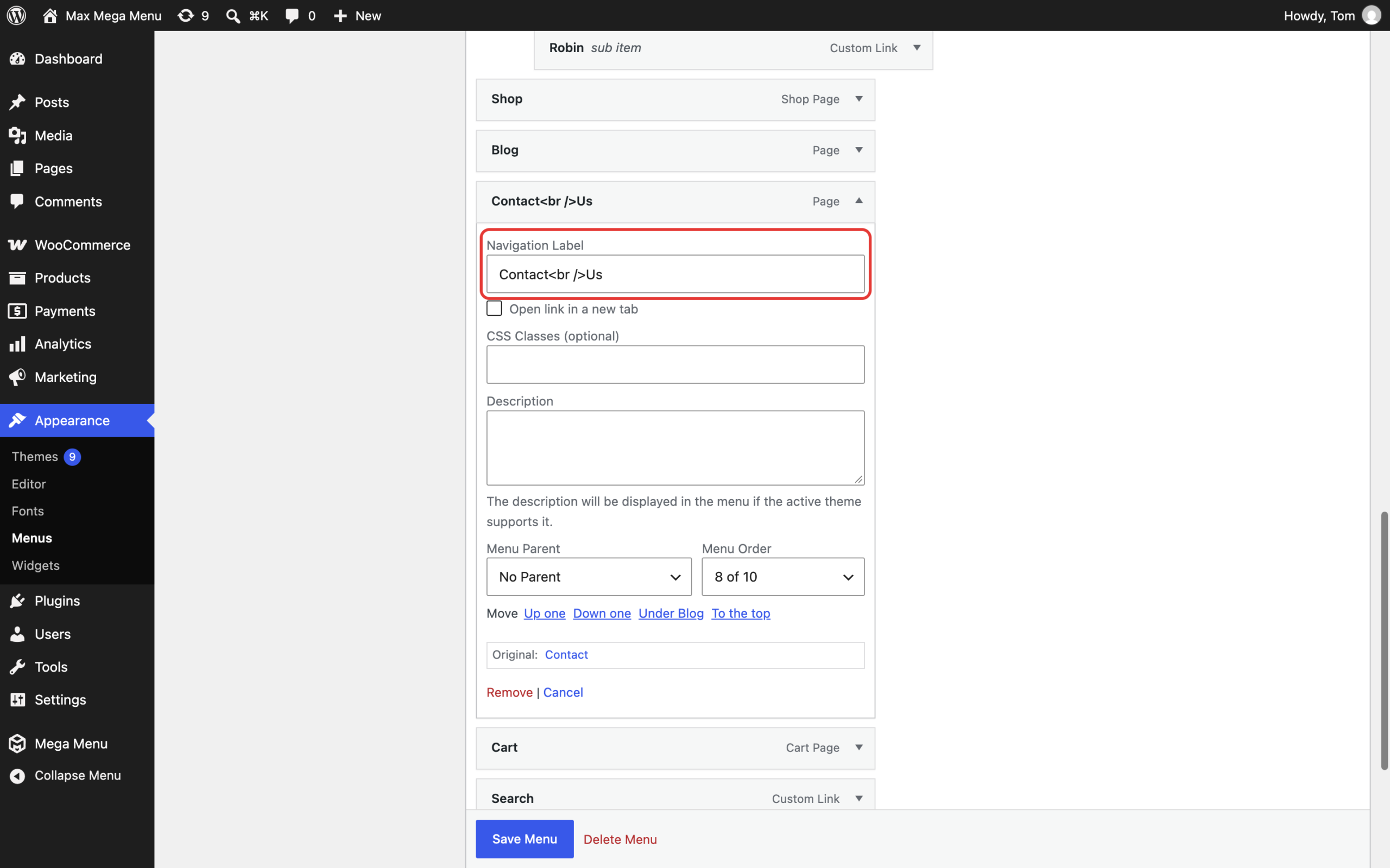
Go to Appearance > Menus, expand the menu item in question and add a <br /> tag to the Navigation Label where you want the text to wrap onto a new line.
Result
The menu item is displayed over two lines, centered within the menu bar:

The line break is also kept in the mobile menu. If you would prefer the text to display on a single line on mobile, go to Mega Menu > Menu Themes and add the following to the Custom Styling area:
|
1 2 3 4 5 |
@include mobile { #{$wrap} #{$menu} li.mega-menu-item > a.mega-menu-link br { display: none; } } |
Adjusting the line height of multi-line menu items
If the lines look too bunched up or spaced too far apart, go to Mega Menu > Menu Themes and add the following to the Custom Styling area:
|
1 2 3 4 5 |
@include desktop { #{$wrap} #{$menu} > li.mega-menu-item > a.mega-menu-link { line-height: 1.2; /* Adjust line height */ } } |
Prerequisites
Your menu will need to be tall enough to accommodate two line menu items. To change the height of the menu, go to Mega Menu > Menu Themes > Menu Bar and adjust the “Menu Height” option.