How to switch a mega menu to a flyout menu on mobile
We often get asked how to switch a mega menu to a fly out menu on mobile.
There is no built in option to let you do this automatically (as mega menus can contain widgets, but fly out menus cannot, so we cannot automatically switch between the two styles reliably), but it’s possible to achieve the same result with a few extra steps.
You can also follow these steps if you are not happy with how a mega menu appears on mobile. By following these steps, you will learn how it is possible to create one mega menu that is displayed on desktop, and a new/different mega menu that is only displayed on mobile.
Example
In this example we’ll make some adjustments so that the “About” menu item and sub menu appears as a flyout menu on mobiles.
Step 1 – Configure the “About” menu item to only show on desktop
The first step is to make sure the “About” menu item and sub menu only appear on the desktop version of the menu.
Go to Appearance > Menus, hover over the top level menu item (in our case it is “About”) and click the blue “Mega Menu” button.
In the Settings tab enable “Hide item on mobile” and save the changes.
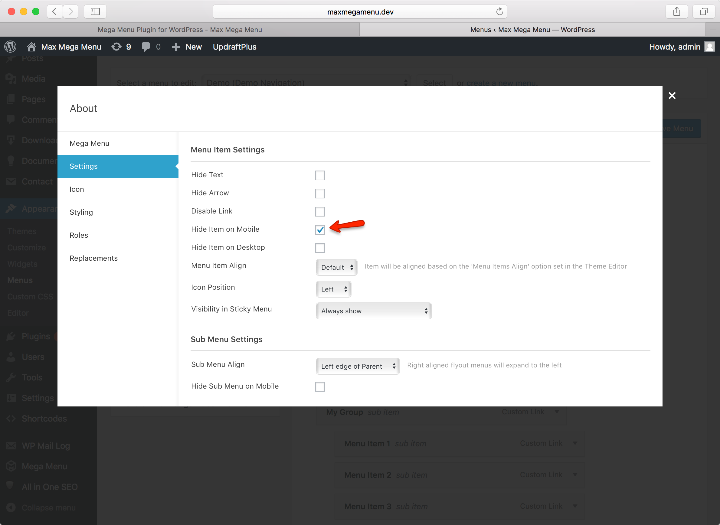 Our “About” menu item and sub menu will now only be visible on the desktop menu.
Step 2 – Add the menu items back to the mobile menu
We can no longer see the “About” menu item or sub menu on mobile, so we now need to create a new top level menu item and sub menu which will only be displayed on mobile.
Under Appearance > Menus, re-add your items to the menu (these ones will only be displayed on mobile). For the new “About” menu item, enable the “Hide item on desktop”.
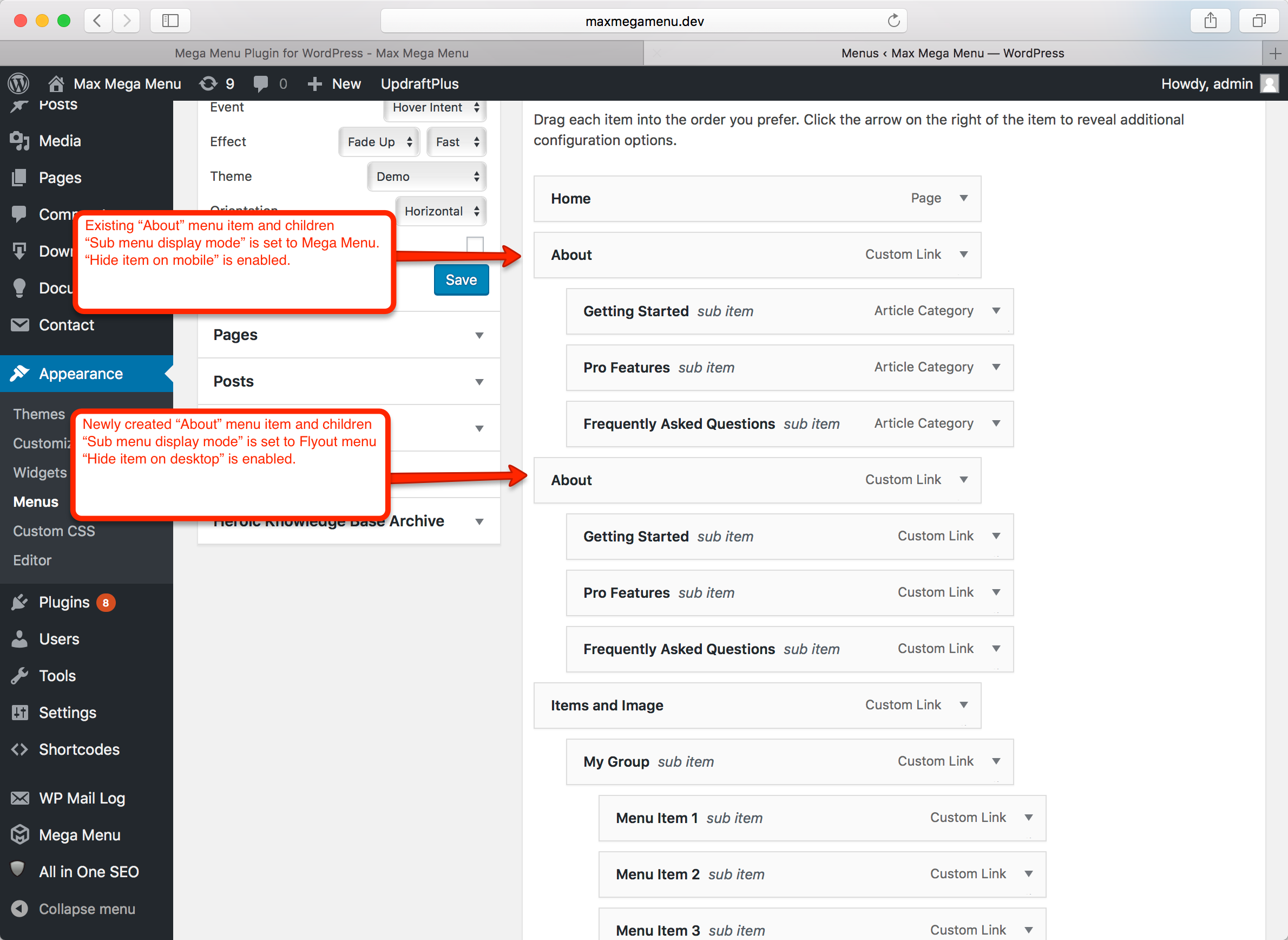
You should end up with 2 sets of menu items – one set which is only displayed on desktop, and a new set which we will only display on mobile.
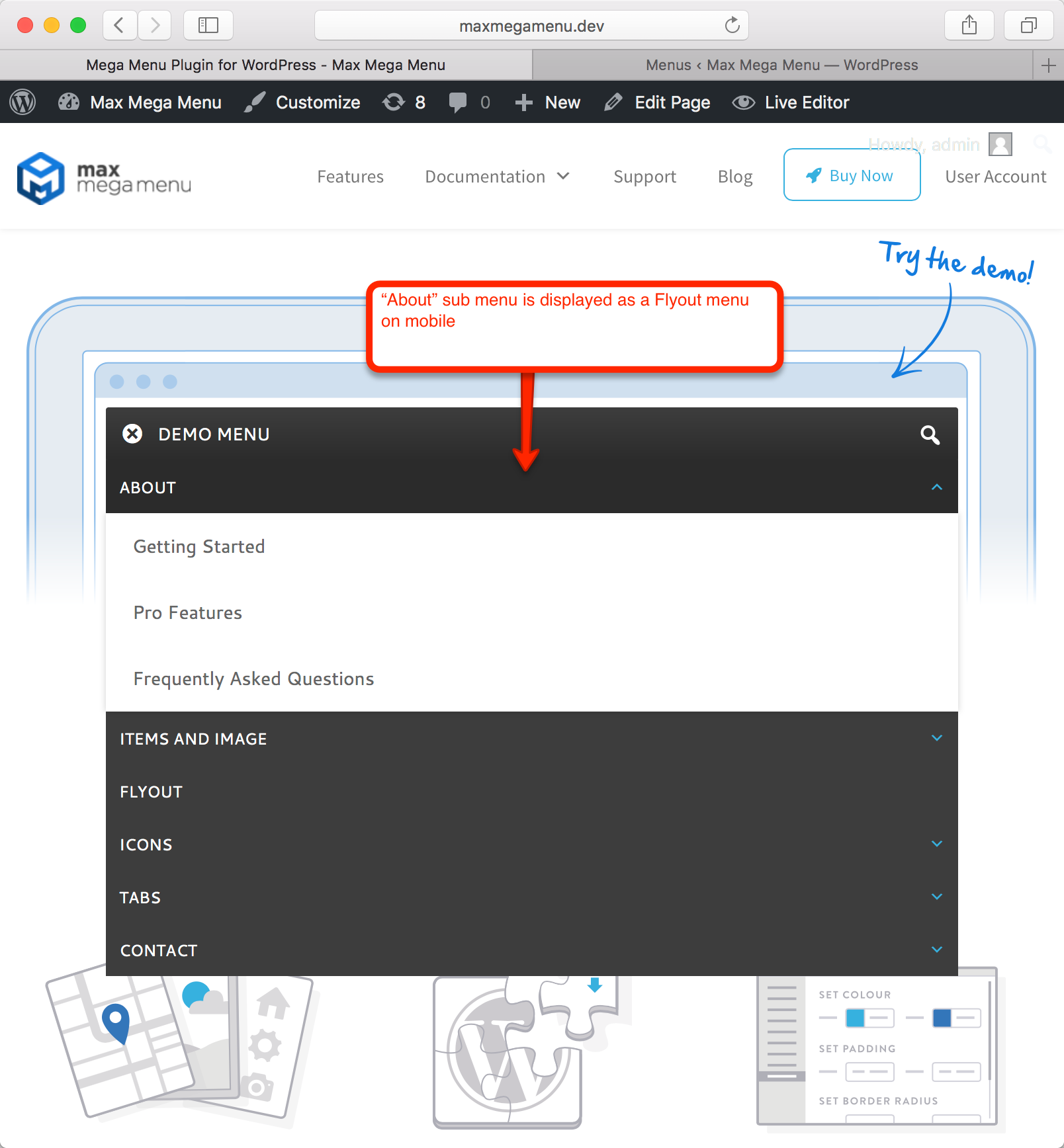
End Result
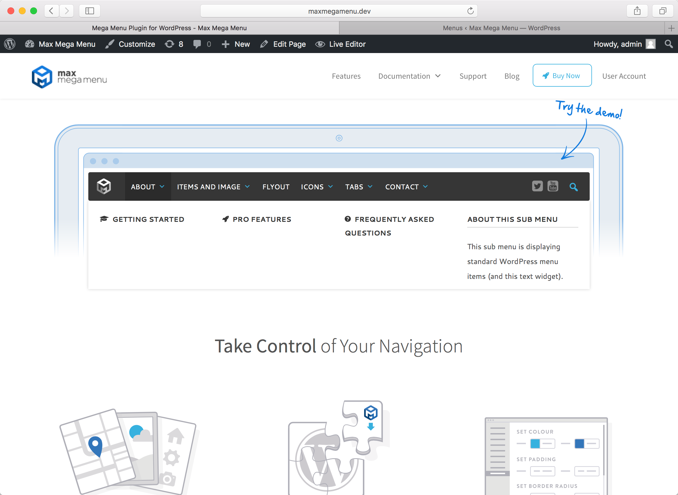
There are no changes to the desktop menu (we still see the mega menu). However, on mobile, we now see the new “About” menu item and flyout sub menu: