Sliding Panels (Mobile Menu)
With Sliding Panels, each sub menu in your mobile menu slides in as a panel of its own, instead of expanding underneath its parent item. A back link at the top of each panel returns the user to the previous level.
This keeps large menus short and easy to navigate on a phone. It works with mega menus, flyout menus and tabbed mega menus.
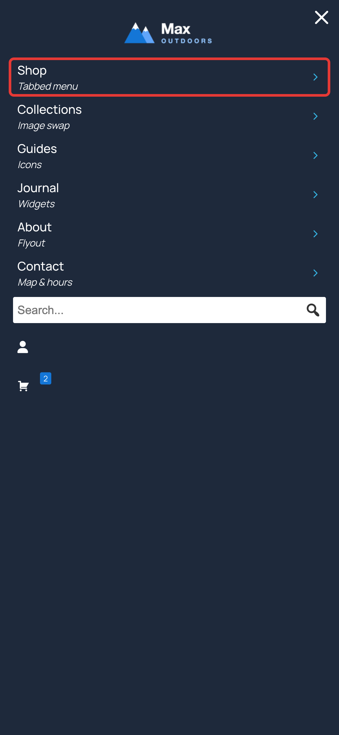
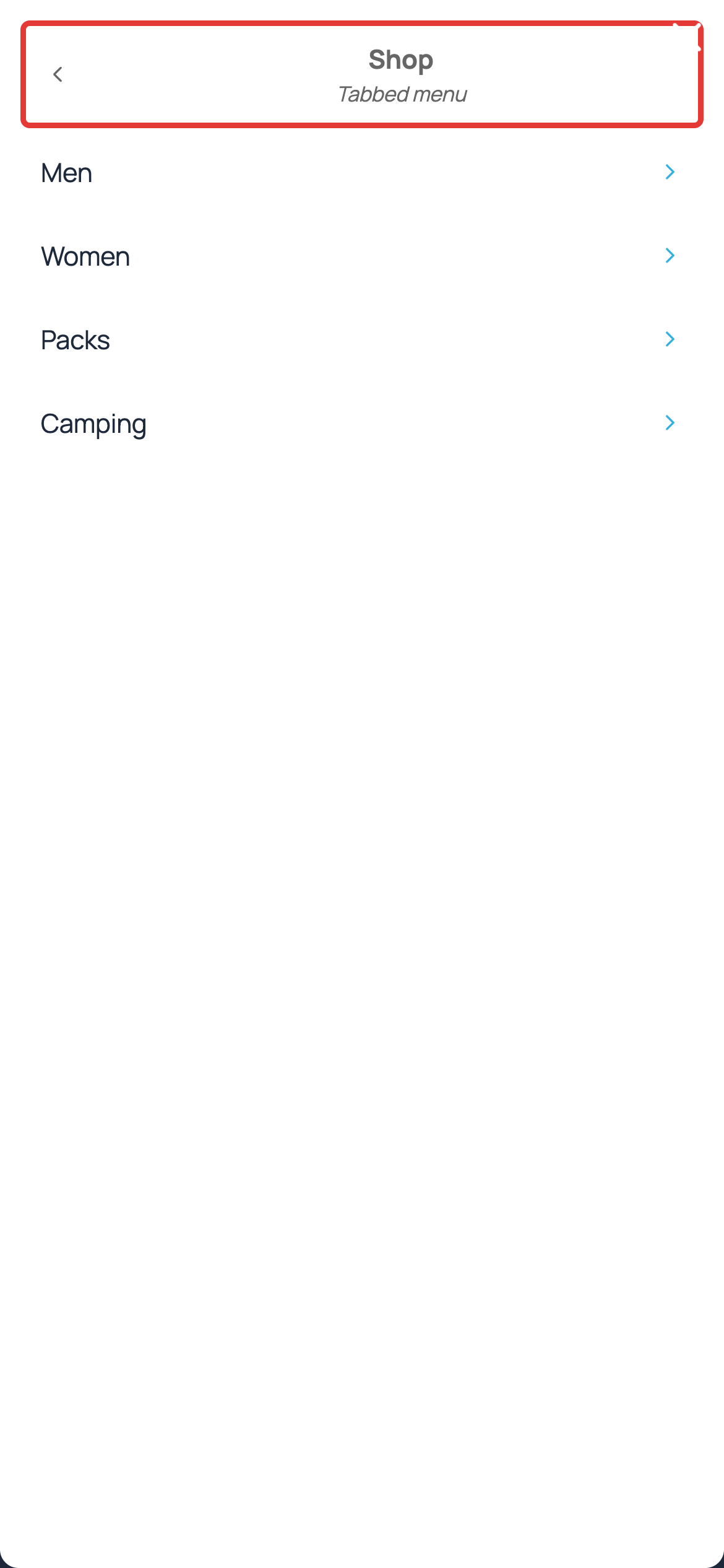
Turning on Sliding Panels
Sliding Panels are available when the mobile menu type is set to Off Canvas. Go to Mega Menu > Menu Locations, open the settings for your menu location and click the Mobile tab:
- Set Type to Off Canvas ← or Off Canvas →
- Set Submenu Style to Sliding Panels
- Click Save
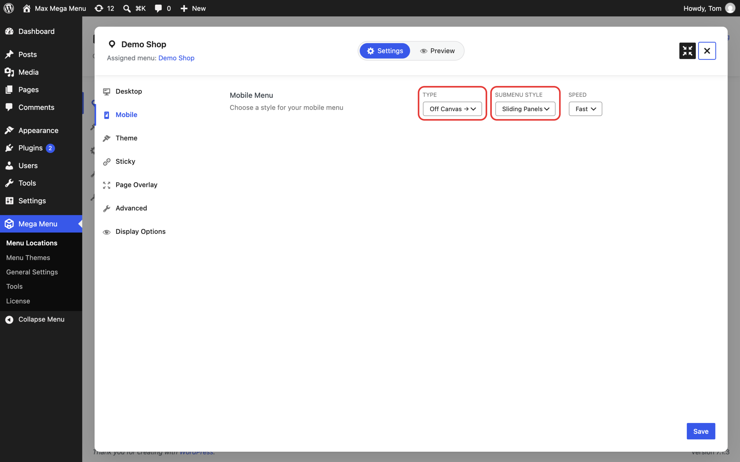
The other Submenu Style option, Accordion, opens each sub menu underneath its parent item. This is the default.
Styling the back link
Go to Mega Menu > Menu Themes, select your menu theme and open the Mobile Menu tab of the Theme Editor. The back link settings are listed under Sliding Panel Settings:
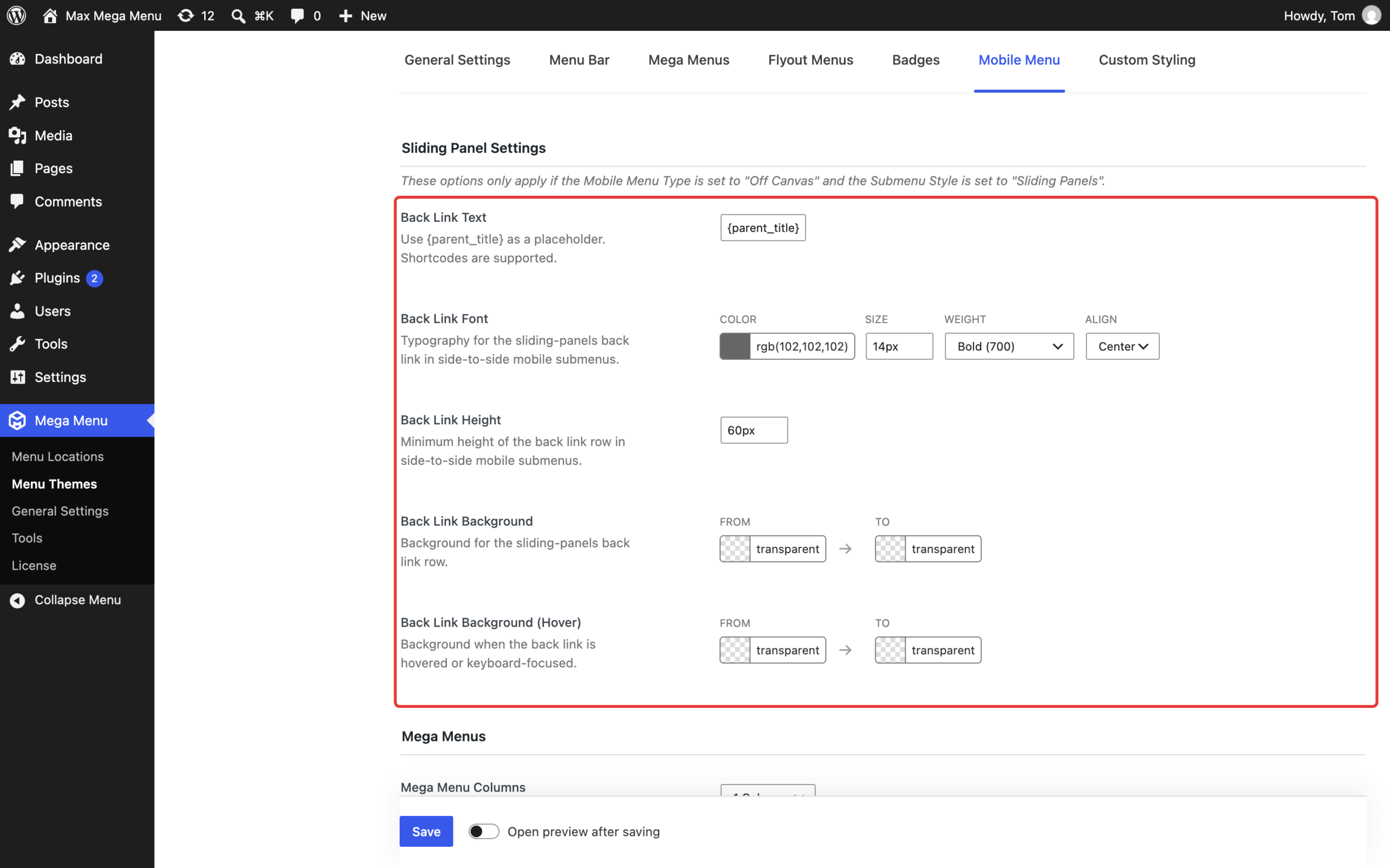
- Back Link Text: the text shown at the top of each panel. The default,
{parent_title}, shows the name of the parent menu item. You can use your own text, such as “Back” or “Back to {parent_title}”. Shortcodes are supported. - Back Link Font: the colour, size, weight and alignment of the back link text.
- Back Link Height: the minimum height of the back link row.
- Back Link Background and Back Link Background (Hover): the background colours for the back link row. The hover colour is also used when the back link has keyboard focus.
Like what you see? This functionality is available in Max Mega Menu Pro